You can find a summary of the code updates in this pull request . Read on for explanations.
1. Examining Figma
Note: You will need to be logged in to Figma to examine the design as described below. You can log in via Google or create a free account.
The design has been specified in this Figma file . There are a few ways we’ll need to examine it.
Padding values
To determine padding values, we can use Figma tools to find distances between the text and the surrounding button container, like we did in the last workshop .
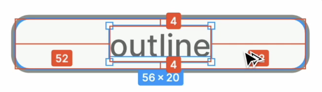
From this we can determine that the padding is 4px, and it’s the same for both variants. Also, in both variants, the text is centered horizontally, so we can use the text-align property for that. Let’s put common CSS in the .wrapper class:
Button.module.css
.wrapper {
  padding: 4px;
  text-align: center;
}
Button dimensions
To find the dimensions of the button background and the radius of the rounded corners, we can select a button rectangle and look at the properties panel on the right:
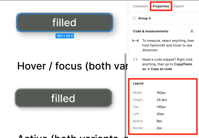
This adds more to our common CSS:
Button.module.css
.wrapper {
  width: 160px;
  padding: 4px;
  text-align: center;

  border-radius: 8px;
  border-width: 2px;
}Text
Similarly, we can get information about the text from the properties panel.
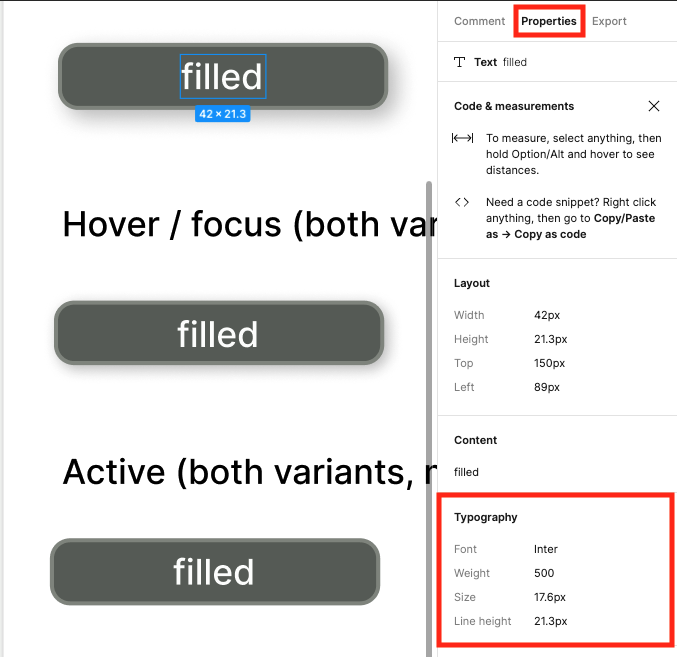
17.6px may seem a strange choice for font size; however it happens to be 1.1rem (1rem is the same as 16px for the standard browsing font size). Basing the font sizes on rem units means the fonts will remain proportionally consistent if the user bumps up the standard font size for their browser.
Let’s add this to the .wrapper CSS, along with the font-weight of 500:
Button.module.css
.wrapper {
  width: 160px;
  padding: 4px;
  text-align: center;

  border-radius: 8px;
  border-width: 2px;

  font-size: 1.1rem;
  font-weight: 500;
}
2. Variants
Now let’s figure out what’s different between the variants, and put those CSS rules into their own classes.
Set up classes
We can add two classes to Button.module.css to hold the rules for each variant. By naming the classes after the variant values, we’ll be able to use styles[variant] for the className.
Button.module.css
.filled {

}

.outline {

}
Now we can apply those classes in the component:
Button.tsx
function Button({
  variant = "filled",
  className,
  children,
  ...delegated
}: ButtonProps) {
  return (
    <button
      className={clsx(
        styles.wrapper,
        styles[variant],
        className)}
      {...delegated}>
      {children}
    </button>
  );
}
For more on why that’s styles[variant] and not styles.variant, see the very first Hands-on Web Dev Challenge . 😁
Add colors from Figma
The colors in Figma are all defined in src/app/globals.css using CSS custom properties .
We can examine the colors in the properties panel in Figma. For example:
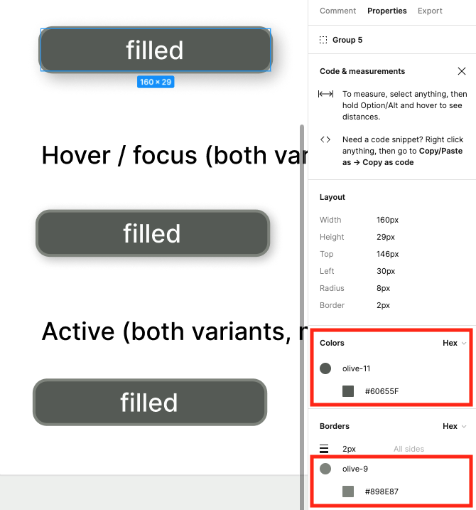
It turns out the border is the same for both variants, so let’s add that to the .wrapper class:
Button.module.css
.wrapper {
  width: 160px;
  padding: 4px;
  text-align: center;

  border-radius: 8px;
  border: 2px solid var(--color-olive-9);

  font-size: 1.1rem;
  font-weight: 500;
}
The variant classes end up like this:
Button.module.css
.filled {
  background-color: var(--color-olive-11);
  color: var(--color-olive-1);
}

.outline {
  background-color: var(--color-olive-2);
  color: var(--color-olive-11);
}
Add shadows
As in the previous workshop for the Card component, we can use the shadow CSS custom properties that were set up in the first workshop of this series.
According to the specifications in Figma, these are the shadows for the non-hover, non-focus, non-active conditions:
Button.module.css
.filled {
  background-color: var(--color-olive-11);
  color: var(--color-olive-1);
  box-shadow: var(--shadow-elevation-medium);
}

.outline {
  background-color: var(--color-olive-2);
  color: var(--color-olive-11);
  box-shadow: var(--shadow-elevation-low);
}
3. Viewing the styles
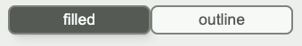
To see whether the button styles look good, we can add one of each variant to the Home component in src/app/page.tsx (same as we did in the previous workshop for Card):
page.tsx
import Button from "@/components/Button";

export default function Home {
  return (
    <main>
      <Button variant="filled">filled</Button>
      <Button variant="outline">outline</Button>
    </main>
  );
};
The low shadow on the outline variant is pretty subtle, and not very easy to see. If you want a less subtle shadow, I’d encourage you to play around with the variables in the shadow generator until you find an effect you like.
4. Pseudo-classes
For the hover, focus and active conditions, we’ll need to use pseudo-classes in our CSS selectors – specifically Use the :hover , :focus and :active
To meet the spec from the Figma doc, here’s what those classes look like. Since the shadow effects are the same for both variants, we can apply them to the .wrapper class.
Button.module.css
.wrapper:hover,
.wrapper:focus {
  box-shadow: var(--shadow-elevation-low);
}

.wrapper:active {
  box-shadow: none;
}
The background color effects need to be applied to each class individually:
Button.module.css
.filled:hover,
.filled:focus,
.filled:active {
  background-color: var(--color-olive-10);
}

.outline:hover,
.outline:focus,
.outline:active {
  background-color: var(--color-olive-3);
}
Up next
In the next (and final) workshop of this series, we will animate the loading spinner.
Workshops in this series
- Setup: files and shadows
- Props and TypeScript
- Delegated props
- Variants: Button component
- Centering: Card component
- Animations: loading spinner