You can find a summary of the code updates in this pull request . Read on for explanations.
1. Card dimensions
Note: You will need to be logged in to Figma to examine the design as described below. You can log in via Google or create a free account.
The design has been specified in this Figma file . We can examine it to see what styles need to be applied.
Padding
To determine padding values, we can use Figma tools to find distances between the text and the surrounding button container. Instructions from the Figma Docs :
- Select the first object in the canvas.
- Hold down the modifier key:
- Mac: ⌥ Option
- Windows: Alt
- Hover over the second object.
- Figma will display a red line between the two objects, as well as horizontal and vertical measurements.
The resulting screen will look something like this:
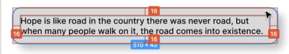
From this we can determine that the padding is 16px, and we can add that to the .wrapper class in src/components/Card/Card.module.css:
Card.module.css
.wrapper {
  padding: 16px;
}
Border radius
The “Properties” pane in Figma gives us the border radius dimension:
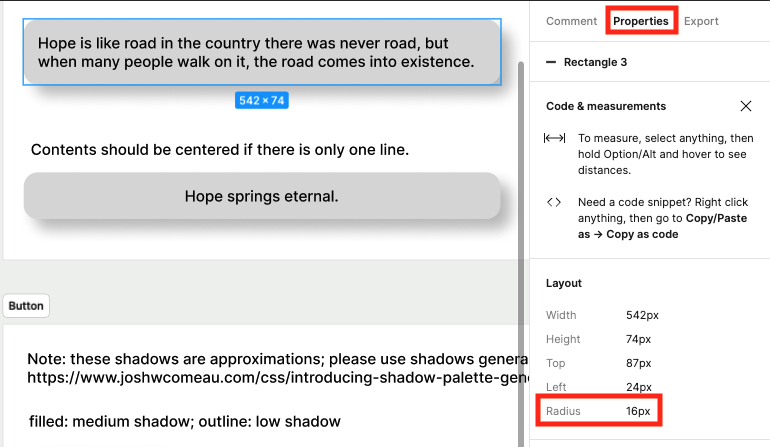
We can add that to the .wrapper class as well:
Card.module.css
.wrapper {
  padding: 16px;
  border-radius: 16px;
}
Width
Finally, the width has been specified as 100% of the container.
Card.module.css
.wrapper {
  width: 100%;
  padding: 16px;
  border-radius: 16px;
}
2. Shadow
In the first workshop of this series, we created shadows using Josh W. Comeau’s Shadow Palette Generator . We added the shadows to src/app/globals.css, so they’re available for us to use via CSS custom properties .
The Figma description specified a “high” shadow, so we’ll add that to .wrapper:
Card.module.css
.wrapper {
  width: 100%;
  padding: 16px;
  border-radius: 16px;
  box-shadow: var(--shadow-elevation-high);
}
3. Card colors
The style attribute helps with applying the props values as styles for the top-level article element.
We’ll create an object that contains CSS rules as key/value pairs. Any keys need to be translated from the kebab case used in CSS to camel case (for example background-color to backgroundColor). Then we can pass that object as the value for the style attribute.
Card.tsx
function Card({
  textColor,
  backgroundColor,
  children,
  ...delegated
}: CardProps) {
  const colorStyles = {
    color: textColor,
    backgroundColor,
  }

  return (
    <article
      style={colorStyles}
      {...delegated}
    >
      {children}
    </article>
  );
}
Props conflict
This works well, as long as the consumer of the Card component doesn’t include any styles. Say the component is declared with styles, though, like this:
// the outer curly braces indicate a JSX expression, and the inner curly braces designate `{ margin: "1rem" }` as an object
<Card style={{ margin: "1rem" }}>
  Some content
</Card>
This presents the same “props conflict” problem described in the third workshop of this series . In that case, There was a className prop coming in from ...delegated, and another className prop declared within the component.
In this case, the prop is style (not className), but the solution is the same: explicitly destructure the style prop and combine the incoming styles with the styles within the comopnent.
We can create a new object from the incoming style prop and the internal colorStyles object using the spread operator .
Card.tsx
function Card({
  textColor,
  backgroundColor,
  style,
  className,
  children,
  ...delegated
}: CardProps) {
  const colorStyles = {
    color: textColor,
    backgroundColor,
  }

  return (
    <article
      className={clsx(styles.wrapper, className)}
      style={{...style, ...colorStyles}}
      {...delegated}
    >
      {children}
    </article>
  );
}
Viewing the styles
To see whether the colors are behaving as we expect, we can add a Card to the Home component in src/app/page.tsx (which displays at the top level of the app).
Note: I used named web colors as prop values here, but you could use any valid color format .
page.tsx
import Card from "@/components/Card";

export default function Home() {
  return (
    <main>
     <Card
       textColor="aliceblue"
       backgroundColor="darkslateblue"
      >
        Why do programmers confuse Halloween with
        Christmas? Because OCT 31 = DEC 25.
      </Card>
    </main>
  );
};
4. Text centering
The description of this specification (“center text shorter than one line, but don’t center text that spans multiple lines”) might indicate that there needs to be different styling for different length text. Separting the styles by text length sounds (to me, anyway) like a bit of a nightmare. How can you tell whether text takes up more than one line, especially when the Card takes up 100% of its container, whose width might change with the viewport?.
Center the text node
Fortunately, the CSS styles do not need to be different depending on the text length. Instead of centering the text, we’re going to center the text node. If the text node takes up less than 100% of the width, then the text will look like it’s centered. But if the text is long enough for more than one line, then the text node needs the full width of its container – and centering something that takes up the full width doesn’t change the position at all.
To visualize this, here’s an example of text node that doesn’t take up the full width of the card:
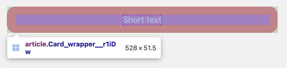
I’ve already set up the container to be a grid with the content centered (spoiler alert!) so that the browser tools provide an outline of the grid cell (a thin, faint, dashed red line that tightly contains the text).
Here’s the same example, but with longer text:
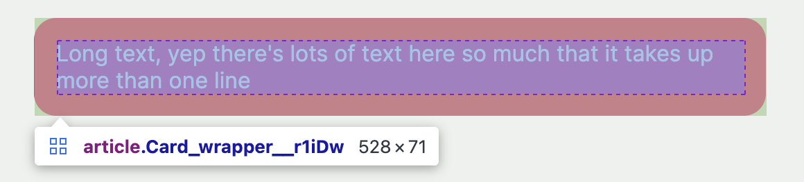
In this case, the multi-line text node is as wide as the usable width of the container (there’s some padding, so the text node doesn’t reach the edges of the container). Centering this node won’t move it on the page, because it’s already centered (with zero space on both the left and the right).
CSS solution
A great trick for centering content within a container (both horizontally and vertically) is display: grid; place-content: center. I use it all the time, and it will work well here (even though the container is vertically sized to fit the content, so the vertical centering isn’t technically needed.)
Card.module.css
.wrapper {
display: grid;
place-content: center;
width: 100%;
padding: 16px;
border-radius: 16px;
box-shadow: var(--shadow-elevation-high);
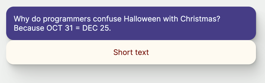
}We can verify that it works by adding another Card to page.tsx.
page.tsx
export default function Home() {
  return (
    <main>
     <Card
       textColor="aliceblue"
       backgroundColor="darkslateblue"
      >
        Why do programmers confuse Halloween with Christmas?
        Because OCT 31 = DEC 25.
      </Card>
      <Card textColor="maroon" backgroundColor="floralwhite">
        Short text
      </Card>
    </main>
  );
};
Up next
In the next workshop, you’ll use your Figma skills again in coding the Button component styles and variants.
Workshops in this series
- Setup: files and shadows
- Props and TypeScript
- Delegated props
- Variants: Button component
- Centering: Card component
- Animations: loading spinner