Workshop context
Before this workshop
- The previous workshops in this series have covered setup and props for the components.
This workshop
- This workshop handles styling for the
Cardcomponent.
After this workshop
- Future workshops in this series will complete the
ButtonandLoadingcomponents. - And, as a reminder, this series (React Components) builds low-level components (
Button,CardandSpinner) for an application.- The application itself will be created in the next two series, Next.js Data Fetching and AI Style Generator .
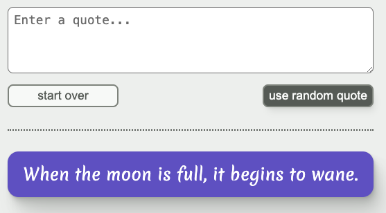
- For context, at the end of the AI Style Generator series, the application will look like this. You can see the
Buttonvariants in the upper part, and a turquoiseCardin the lower part.
Workshop goal
By the end of this workshop
- The
Cardcomponent will display styles that match this Figma document .- Note: to examine the details of the design, you will need to log in to Figma. You can log in via Google or create a free account.
- The font and background colors for the card will be determined by the
Cardprops values (you can ignore the colors in the Figma document). - The card should take up 100% of its container’s width.
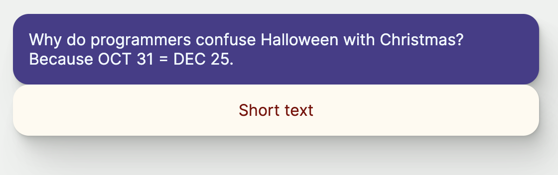
- If there’s one line of content, that line should be centered horizontally within the card. More than one line of content should be left-aligned.
- Here’s an example of one card with long text, followed directly by one card with short text:
Hints
Hint 1
You will need to be logged in to Figma to examine the design as described below. You can log in via Google or create a free account.
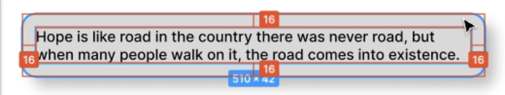
To determine padding values, you can use Figma tools to find distances between the text and the surrounding card container. Instructions from the Figma Docs :
- Select the first object in the canvas.
- Hold down the modifier key:
- Mac: ⌥ Option
- Windows: Alt
- Hover over the second object.
- Figma will display a red line between the two objects, as well as horizontal and vertical measurements.
The resulting screen will look something like this:
Hint 2
You will need to be logged in to Figma to examine the design as described below. You can log in via Google or create a free account.
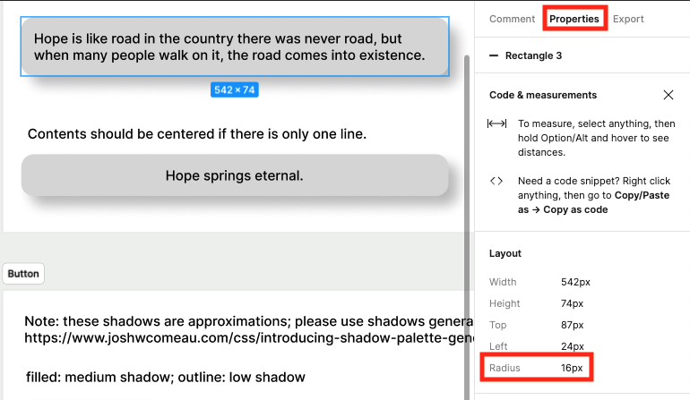
To find the the radius of the rounded corners, select a card rectangle and look at the properties panel on the right:
Hint 3
If you need a refresher on the shadows we created in workshop 1 of this series and how to use them, see this challenge solution .
Hint 4
Take a look at the React docs for the style attribute in React. (You can skip the initial part about className and go straight to the part about the style attribute).
Hint 5
For the centering requirement, you can use a grid layout with place-content set to center. This will automatically center content shorter than one line (since that element will have a width equal to the length of the content) and keep content left-aligned if it’s longer than one line (since the place-content will apply to the entire text element, and not each individual line).
Hint 6
To see whether your styles are behaving as you expect, you can add Card components with content of different length to the Home component in src/app/page.tsx file (this the component rendered when you load http://localhost:3000). You can remove the Card components from page.tsx once you’re satisfied the card is styled correctly.
Note: the Card styling does not need to include margins. In general, it is the responsibility of the parent to determine the layout of its children relative to one another, not the responsibility of the children components themselves. The spacing relative to other elements is likely to change depending on the parent layout.
Resources
- Figma: Measure distances between layers
- Figma: Design Panel
- React docs for the
styleattribute (You can skip the initial part aboutclassNameand go straight to the part about thestyleattribute)