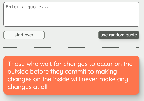
This workshop add styling to the Button component, including variants.
Workshop context
Before this workshop
- The previous workshops in this series have covered setup and props for three components.
This workshop
- This workshop handles styling for the
Buttoncomponent.
After this Workshop
- The last workshop in this series will complete the
Loadingcomponent. - And, as a reminder, this series (React Components) builds low-level components (
Button,CardandSpinner) for an application.- The application itself will be created in the next two series, Next.js Data Fetching and AI Style Generator .
- For context, at the end of the AI Style Generator series, the application will look like this. You can see the
Buttonvariants in the upper part, and an orangeCardin the lower part.
Workshop goal
By the end of this workshop, the Button component will display styles that match this Figma document .
Note: to examine the details of the design, you will need to log in to Figma. You can log in via Google or create a free account.
Hints
Hint 1
You will need to be logged in to Figma to examine the design as described below. You can log in via Google or create a free account.
See hints 1 and 2 from the previous challenge for details on how to examine the Figma document. You’ll probably want to examine both the background and the text boxes for details.
The colors are all defined using CSS custom properties in src/app/globals.css.
Hint 2
If you need a refresher on the shadows we created in workshop 1 of this series and how to use them, see this challenge solution .
Hint 3
You can add multiple classes to the button element – say, one that applies to both variants, plus the class that applies to the variant specified in the props.
Hint 4
Use the :hover , :focus and :active pseudo-classes to match the styles shown on the Figma document for those conditions.
Hint 5
To see whether your styles are behaving as you expect, you can add a Button for each variant to the Home component in the src/app/page.tsx file (which displays at the top level of the app). You can remove the Buttons once you’re satisfied the buttons are styled correctly.
Note: the Button styling does not need to include margins. In general, it is the responsibility of the parent to determine the layout of its children relative to one another, not the responsibility of the children components themselves. The spacing relative to other elements is likely to change depending on the parent layout.