Workshop context
Series overview
- This series (React Components) builds low-level components (
Button,CardandSpinner) for an application.
This workshop
- In this workshop you’ll lay the groundwork for three new React components by creating files and shadow CSS custom properties. To start, fork or clone the scaffolding repository . Take a look at the README for instructions to install and run the app.
After this workshop
- The application itself will be created in the next two series, Next.js Data Fetching and AI Style Generator .
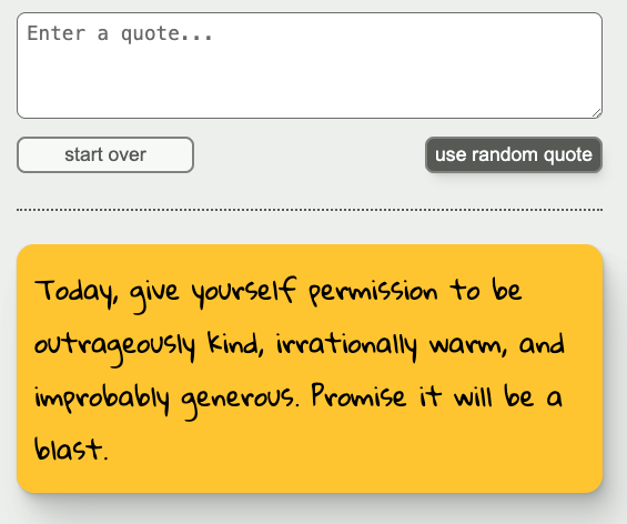
- For context, at the end of the AI Style Generator series, the application will look like this. You can see the
Buttonvariants in the upper part, and a yellowCardin the lower part.
Workshop goal
By the end of this workshop you will have:
- files for
Button,CardandSpinnercomponents- On MacOS and Linux, you can use the
new-componentnpm script (defined in package.json) to create files for a new component. - Since
new-componentisn’t guaranteed to work on Windows, Windows users can create files manually, using the thenew-componentREADME for reference. new-componentcreates files for CSS Modules. If you prefer to use a different styling system (say, Tailwind CSS or Pigment CSS ), feel free to set up your components for your preferred system instead.
- On MacOS and Linux, you can use the
- CSS custom properties for three shadow styles (low, medium and high), from Josh W. Comeau’s Shadow Palette Generator
- These shadows will be used for styling
ButtonandCardin future workshops.
- These shadows will be used for styling
Hints
Hint 1
You can run the new-component npm script with this command: npm run new-component ComponentName, (replacing ComponentName with the name of your new component). For more information on the script, see the README .
Hint 2
Update the background color in the Shadow Palette Generator to be the app’s background color: #eff1ef (you can find that defined in src/app/globals.css as the background-color for the body). Click on the background color swatch in the generator and add the new color in the color picker like this:
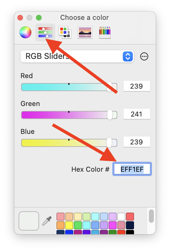
(Your color picker may look a little different depending on what browser and operating system you’re using.) All the other parameters can use the default (or play around with them to find something you like better!). Then add the generated tokens to src/app/globals.css.
Resources
- Josh W. Comeau’s Delightful File Structure
- Josh W. Comeau’s Shadow Palette Generator