You can find a summary of the code updates in this pull request . Read on for explanations.
1. Restructure components
To keep QuoteContent from being bogged down in too many details, let’s make a new QuoteDetails component.
Rename QuoteContent
QuoteContent’s role is not going to be display the quote’s content anymore – that’s going to fall to QuoteDetails. For a more accurate name, let’s rename QuoteContent to QuoteDisplay.
For this, we’ll have to rename the directory QuoteContent to QuoteDisplay, and QuoteContent.tsx to QuoteDisplay.tsx. Since we weren’t using QuoteDisplay.module.css anyway, I removed that file and its import.
We also need to rename the component from QuoteContent to QuoteDisplay within the files, and update src/app/page.tsx to use the new component name.
You may have VSCode set up to update the import locations when filenames change; if you don’t then you’ll have to update the imports in src/app/page.tsx and src/components/QuoteDisplay/index.ts as well.
QuoteDisplay/index.ts
export * from "./QuoteDisplay";
export { default } from "./QuoteDisplay";
QuoteDisplay.tsx
export interface QuoteDisplayProps {
  // ...
}

function QuoteDisplay(
  { status, quoteProperties, error }: QuoteDisplayProps
) {
  // ...
}

export default QuoteDisplay;
src/app/page.tsx
import Button from "@/components/Button";
import QuoteDisplay from "@/components/QuoteDisplay";
import Separator from "@/components/Separator";
import useQuoteStyles from "@/hooks/use-quote-styles";

export default function Home() {
  // ...
  return (
    <main>
      {/* ... */}
      <QuoteDisplay
        status={status}
        quoteProperties={quoteProperties}
        error={error}
      />
    </main>
  );
}
Create QuoteDetails
Then, the QuoteDisplay component can return QuoteDetails (instead of a Card) when quoteProperties is truthy. The QuoteDetails component can take quoteProperties as a prop.
Because QuoteDetails will never be loaded from any component other than QuoteDisplay, QuoteDetails.tsx and QuoteDetails.module.css should be placed directly in the QuoteDisplay folder, and not given their own folder. For more on why, check out Josh W. Comeau’s post on Delightful File Structure .
The files can start with the usual default content from new-component .
QuoteDetails.module.css
.wrapper {
}
QuoteDetails.tsx
import React from 'react';

import styles from './QuoteDetails.module.css';

export interface QuoteDetailsProps {};

function QuoteDetails({}: QuoteDetailsProps) {
  return <div className={styles.wrapper}></div>;
}

export default QuoteDetails;
Move Card
The whole reason we created QuoteDetails is so that it can contain all the messy details of the font and the properties table that we’re going to write in this workshop.
For now, we only have the Card displaying the quote in QuoteDisplay. Let’s move that to QuoteDetails in anticipation of adding lots more code to QuoteDetails eventually.
QuoteDetails.tsx
// ...
import type { QuoteProperties } from "@/types";

import Card from "../Card";
import styles from './QuoteDetails.module.css';

export interface QuoteDetailsProps {
  quoteProperties: QuoteProperties;
}

function QuoteDetails(
    { quoteProperties }: QuoteDetailsProps
) {
  const { quote, colors } = quoteProperties;

  return (
    <div className={styles.wrapper}>
      <Card
        textColor={colors.text}
        backgroundColor={colors.background}
        style={fontStyle}
      >
        {quote}
      </Card>
    </div>
  );
}
QuoteDisplay.tsx
// ...
import QuoteDetails from "./QuoteDetails";
// ...

function QuoteDisplay(
  { status, quoteProperties, error }: QuoteDisplayProps
) {
  // ...
  if (quoteProperties) {
    return <QuoteDetails quoteProperties={quoteProperties} />;
  }

  // ...
}
2. Load the font
This workshop would be a lot more difficult if it weren’t for use-googlefonts . This package loads a Google font dynamically based on the font name so the page can use the font – exactly what we need.
First we need to install the package:
npm install @flyyer/use-googlefontsThen we need to import and call useGoogleFonts in QuoteDetails.tsx. Since the spec asked for a weight of 400, the call looks like this:
QuoteDetails.tsx
import {
  GoogleFontsStatus,
  useGoogleFonts
} from "@flyyer/use-googlefonts";
// ...

function QuoteDetails(
    { quoteProperties }: QuoteDetailsProps
) {
  const { quote, colors, fontName } = quoteProperties;

  const font = useGoogleFonts([
    {
      family: fontName,
      styles: [400],
    },
  ]);

  // show an error if the call failed
  if (font.status === GoogleFontsStatus.FAILED) {
    console.error(font.error);
  }
  // ...
}
3. Apply the font
Now that the font is loaded for the page, we can apply it with CSS. We’ll pass a style prop to Card, and – thanks to our work in a previous workshop series – the font styles will be merged with the other Card styles.
QuoteDetails.tsx
export function QuoteDetails(
  { quoteProperties }: QuoteDetailsProps
) {
  // ...

  const fontStyle = {
    fontFamily: fontName,
  };

  return (
    <Card
      textColor={colors.text}
      backgroundColor={colors.background}
      style={fontStyle}
    >
      {quote}
    </Card>
  );
}
Avoid FOUT
To avoid FOUT (Flash of Unstyled Text) before the font is ready, we’ll conditionally define the text color for the card to be:
- the background color while the
font.statusvalue isGoogleFontsStatus.LOADING(if the text color is the same as the background color, the result will look like a blank card) - the actual text color if
font.statusis anything other thanGoogleFontsStatus.LOADING(this will allow the quote to show with a default font in the event thatuseGoogleFontsfails.)
QuoteDetails.tsx
export function QuoteDetails(
  { quoteProperties }: QuoteDetailsProps
) {
  // ...

  // to avoid FOUT
  const textColor =
    font.status === GoogleFontsStatus.LOADING
      ? colors.background
      : colors.text;

  // ...

  return (
    <Card
      textColor={textColor}
      backgroundColor={colors.background}
      style={fontStyle}
    >
      {quote}
    </Card>
  );
}
Font sizes
We’ll use media queries to manage the different font sizes for different screen widths.
Let’s enclose the Card in its own section (since we’ll have another section for the quote properties in a moment).
QuoteDetails.tsx
export function QuoteDetails(
  { quoteProperties }: QuoteDetailsProps
) {
  // ...

  return (
    <section className={styles.quoteCard}>
      <Card
        textColor={textColor}
        backgroundColor={colors.background}
        style={fontStyle}
      >
        {quote}
      </Card>
    </section>
  );
}
Then we can style the section with the specified font sizes. The card will inherit the font sizes from its parent section.
QuoteDetails.module.css
.quoteCard {
font-size: 1.5rem;
}
@media (min-width: 50rem) {
.quoteCard {
font-size: 1.75rem;
}
}
@media (min-width: 68.75rem) {
.quoteCard {
font-size: 2rem;
}
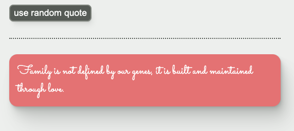
}Let’s fire up the server and get a quote. Check out the font! Not incredibly readable… but it’s an unusual font, just like I requested.
4. Quote properties
Onward, to quote properties.
New section
Let’s create a new section, and add a wrapper div around both section in QuoteDetails.
QuoteDetails.tsx
export function QuoteDetails(
  { quoteProperties }: QuoteDetailsProps
) {
  // ...
  return (
    <div className={styles.wrapper}>
      <section className={styles.quoteCard}>
        <Card
          textColor={textColor}
          backgroundColor={colors.background}
          style={fontStyle}
        >
          {quote}
        </Card>
      </section>
      <section className={styles.quoteStyles}>
        <h2>Quote Properties</h2>
        {/* properties go here */}
      </section>
    </div>
  );
}
Add properties
Ok, let’s start adding the properties. A grid looks like a good call here for layout. Let’s start there:
QuoteDetails.tsx
export function QuoteDetails(
  { quoteProperties }: QuoteDetailsProps
) {
  // ...
  return (
    <div className={styles.wrapper}>
      {/* ... */}
      <section className={styles.quoteStyles}>
        <h2>Quote Properties</h2>
        <div className={styles.styleItemsGrid}>
          {/* properties go here */}
        </div>
      </section>
    </div>
  );
}
QuoteDetails.module.css
{/* ... */}

.styleItemsGrid {
  display: grid;
  grid-template-columns: min-content 1fr;
  gap: 1rem;
}
This line is a little cryptic:
.styleItemsGrid {
  display: grid;
  grid-template-columns: min-content 1fr;
  gap: 1rem;
}
It means “for the first column, take up as much room as needed for the content (but no more). For the second column, take up the rest of the room.”
New component
All right now for the actual properties. Since each property “row” has a lot in common, let’s create another new component called QuoteStyleItem, which we can re-use for every row. The files for this component go into the QuoteDisplay folder since the component is not useful outside of QuoteDisplay.
(If we ever wanted to use this same style table elsewhere in our app, we could refactor the whole table to be a its own generic component at the top level of src/components.)
QuoteStyleItem.tsx
import React from "react";

import styles from "./QuoteStyleItem.module.css";

type QuoteStyleItemProps = {
  name: string;
  value: string;
};

const QuoteStyleItem = ({ name, value }: QuoteStyleItemProps) => {
  return (
    <>
      <div className={styles.propertyTitle}>{name}</div>
      <div>{value}</div>
    </>
  );
};

export default QuoteStyleItem;
<> and </> are shorthand for React.Fragment . Those need to wrap the two divs so that the component returns a group of elements without adding a parent element that will show up in the DOM. This is important, because we need these elements to be separate for the grid to work correctly. To see what I mean, you can try using a div instead of <>, and observe the effect on the UI.
QuoteStyleItem.module.css
.propertyTitle {
  font-weight: bold;
  justify-self: right;
}
justify-self is a property for grid children that sets the horizontal justification. Since the default value is left, we don’t need to set justify-self explicitly for the “value” cell.
Put it all together
Let’s add the properties in QuoteDetails:
QuoteDetails.tsx
export function QuoteDetails(
{ quoteProperties }: QuoteDetailsProps
) {
const {
quote,
description,
colors,
fontName
} = quoteProperties;
// ...
return (
<div className={styles.wrapper}>
{/* ... */}
<section className={styles.quoteStyles}>
<h2>Quote Properties</h2>
<div className={styles.styleItemsGrid}>
<QuoteStyleItem
name="description"
value={description}
/>
<QuoteStyleItem
name="color"
value={colors.background}
/>
<QuoteStyleItem
name="font"
value={fontName}
/>
</div>
</section>
</div>
);
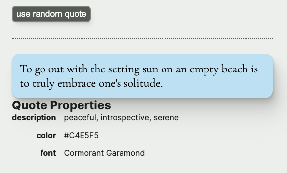
}Let’s take a look at how we’re doing:
Spacing
It’s looking pretty good, but everything is kind of squished together horizontally.
We can add some flex styling to .wrapper to put space between the sections, and some styling to .quoteStyles to put some space between the heading and the table.
QuoteDetails.module.css
.wrapper {
  display: flex;
  flex-direction: column;
  gap: 2rem;
}

{/* ... */}

.quoteStyles {
  display: flex;
  flex-direction: column;
  gap: 1rem;
}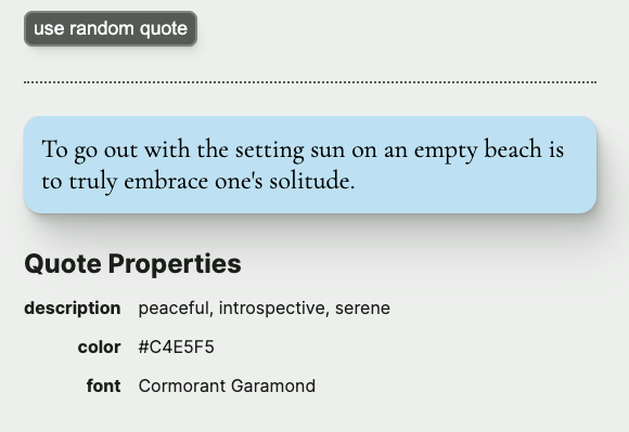
Ah, that leaves me feeling much more serene.
Up next
In the next (and final) workshop in this series, we’ll allow the user to enter their own quote, instead of using a random quote.