Workshop context
Before this workshop
- In the last workshop, we updated the response from the
api/get-quote-stylesroute to includedescriptionandfont.
This workshop
- In this workshop, we’ll add the description and font to the UI.
After this workshop
- In the next (and final) workshop in this series, we’ll allow the user to enter their own quote, instead of using a random quote.
Workshop goal
By the end of this workshop you will have:
- The quote displayed in the selected Google font.
- the quote should not display with the default font before displaying with the selected font.
- the selected font should use the weight
400. - the card should display the selected font at these sizes:
1.5remuntil the screen size is50remor wider1.75remuntil the screen is68.75remor wider2remif the screen is68.75remor wider
- you may find the use-googlefonts package useful.
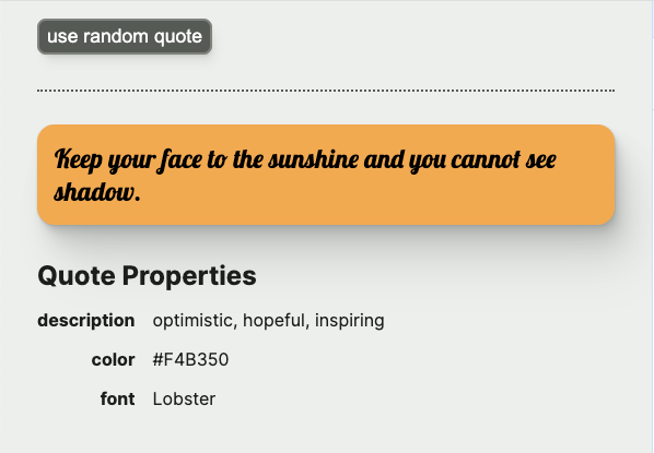
- The description, background color and font displayed beneath the quote, like this:
Hints
Hint 1
To keep QuoteContent from being bogged down in too many details, you may want to make a new QuoteDetails comopnent. For a more accurate name, you might rename QuoteContent to QuoteDisplay (since it’s sometimes displaying quote content, and sometimes displaying a loading spinner or error).
Then, the QuoteDisplay component can return QuoteDetails when quoteProperties is truthy (where it used to return a Card containing the quote). The QuoteDetails component can take quoteProperties as a prop.
Because QuoteDetails will never be called from any component other than QuoteDisplay, QuoteDetails.tsx and QuoteDetails.module.css should be placed directly in the QuoteDisplay folder, and not given their own folder. For more details, check out Josh W. Comeau’s post on Delightful File Structure .
Hint 2
Use the use-googlefonts package to make the google font available to the page. This package does not come with the project, so you will need to install it:
npm install @flyyer/use-googlefontsSince the spec asked for a weight of 400, the call in QuoteDetails looks like this:
const font = useGoogleFonts([
  {
    family: fontName,
    styles: [400],
  },
]);
Hint 3
QuoteDetails should display a Card containing the quote, like QuoteDisplay used to. For the font, you can pass a style prop to Card, and – thanks to our work in this workshop – the styles will be merged with the Card styles.
Since our use-googlefonts code has made the font available to the page, all you need to do is specify the fontName as the fontFamily value for the style.
For example:
const fontStyle = {
  fontFamily: fontName,
};

<Card
  textColor={colors.text}
  backgroundColor={colors.background}
  style={fontStyle}
>
  {quote}
</Card>
Hint 4
To avoid FOUT (Flash of Unstyled Text) before the font is ready, conditionally define the text color for the card to be:
- the background color while the
font.statusvalue isGoogleFontsStatus.LOADING(note, you can importGoogleFontsStatusfrom “@flyyer/use-googlefonts”). If the text color is the same as the background color, the result will look like a blank card. - the actual text color if
font.statusis anything other thanGoogleFontsStatus.LOADING
Hint 5
For the table of properties under the quote, I created a section within QuoteDisplay that had an h2 (“Quote Properties”) and a div that used display: grid for the properties themselves.
I created a new component: QuoteStyleItem to re-use for every row. This component takes a name prop (for example “description”) and a value prop (for example, “optimistic, hopeful, inspiring”). The files for this new component went into the QuoteDisplay folder since the component is only going to be used within QuoteDisplay.
The name in QuoteStyleItem is bold and right-aligned.
Resources
- use-googlefonts npm package
- MDN media queries