You can find a summary of the code updates in this pull request . Read on for explanations.
1. Create component files
I adapted Josh W. Comeau’s new-component module to create component files with CSS Modules that follow his delightful file structure .
I like this file structure because:
- it’s pretty simple to import any component into any other component without having to hunt around.
- The directories keep everything contained for individual components, and the index.ts files mean you can use the directory path for import (like
import Button from "../Button") -- but all the significant code is in a file with the component name (Button.tsx`, for example). - You could put all the code in the index.ts file, but then you might have a bunch of index.ts files open in your IDE tabs. It’s easier to identify which file you want if the filename matches the component name.
If you’re on MacOS or Linux (apologies to Windows users), the new-component script creates the files for you. Windows users can read the README to see what files they need to create. Here are the commands I ran on MacOS:
Terminal commands
npm run new-component Button
npm run new-component Card
npm run new-component Spinner
Windows users can create files manually, using the the new-component README for reference.
2. Generate shadows
Josh has also created a Shadow Palette Generator which creates pretty nice-looking shadows.
We need to update the background color in the Shadow Palette Generator to be the app’s background color: #eff1ef (defined in src/app/globals.css as the background-color for the body). Click on the background color swatch in the generator and add the new color in the color picker like this:
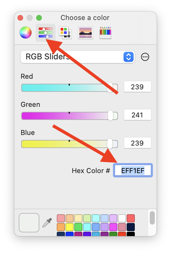
(Your color picker may look a little different depending on what browser and operating system you’re using.) All the other parameters can use the default (or play around with them to find something you like better!).
Define shadows in CSS
To make the shadows available to components, add the generated tokens to src/app/globals.css:
globals.css
:root {
  /* ... other root css ... */

  /* generated from https://www.joshwcomeau.com/shadow-palette/ */
  --shadow-color: 120deg 2% 64%;
  --shadow-elevation-low: 0.3px 0.5px 0.6px hsl(var(--shadow-color) / 0.41),
    0.4px 0.7px 0.8px -1.8px hsl(var(--shadow-color) / 0.33),
    0.9px 1.8px 1.9px -3.6px hsl(var(--shadow-color) / 0.24);
  --shadow-elevation-medium: 0.3px 0.5px 0.6px hsl(var(--shadow-color) / 0.43),
    0.6px 1.2px 1.3px -1.2px hsl(var(--shadow-color) / 0.37),
    1.7px 3.5px 3.7px -2.4px hsl(var(--shadow-color) / 0.3),
    4.6px 9.2px 9.9px -3.6px hsl(var(--shadow-color) / 0.24);
  --shadow-elevation-high: 0.3px 0.5px 0.6px hsl(var(--shadow-color) / 0.4),
    0.8px 1.7px 1.8px -0.5px hsl(var(--shadow-color) / 0.37),
    1.6px 3.2px 3.4px -1px hsl(var(--shadow-color) / 0.34),
    3px 5.9px 6.4px -1.5px hsl(var(--shadow-color) / 0.31),
    5.2px 10.4px 11.2px -2.1px hsl(var(--shadow-color) / 0.28),
    8.7px 17.4px 18.7px -2.6px hsl(var(--shadow-color) / 0.25),
    13.9px 27.7px 29.8px -3.1px hsl(var(--shadow-color) / 0.22),
    21px 42px 45.1px -3.6px hsl(var(--shadow-color) / 0.19);
}
I like to reference where I got code in comments, both for attribution reasons and so I can look up the source in the future without having to think too hard about where it came from.
How to use shadows
Now these shadows are available for us to use in CSS rules in the future, like this:
box-shadow: var(--shadow-elevation-medium);All right! We’re in good shape to write code for the rest of this series. Next up: props and TypeScript.
Workshops in this series
- Setup: files and shadows
- Props and TypeScript
- Delegated props
- Variants: Button component
- Centering: Card component
- Animations: loading spinner