You can find a summary of the code updates in this pull request . Read on for explanation.
1. Create ErrorCard
Let’s create an ErrorCard component that’s a more specific version of Card (with pre-defined colors and contents). This app comes with a handy new-component script that we can use on Linus or MacOS to generate the component files. Since new-component isn’t guaranteed to work on Windows, Windows users can create files manually, using the new-component README for reference.
npm run new-component ErrorCardThen, in src/components/ErrorCard/ErrorCard.tsx, we can add props and colors based on the spec:
ErrorCard.tsx
import React from "react";
import Card from "../Card";

export interface ErrorCardProps {
  // optional, could be undefined
  error?: string;
}

function ErrorCard({ error }: ErrorCardProps) {
  return (
    <Card backgroundColor="var(--color-tomato-11)" textColor="white">
      <h2>An error occurred</h2>
      <p>{error}</p>
    </Card>
  );
}

export default ErrorCard;
--color-tomato-11 isn’t defined yet, so we’ll need to add that to src/app/globals.css. We could put a literal color string in the ErrorCard component (backgroundColor="#d13415"), but I like to define colors in globals.css to keep everything tidy and consistent. I got the hex code from the Radix colors page , as indicated in the spec.
globals.css
:root {
  /* colors from Radix UI colors: https://www.radix-ui.com/colors */
  --color-tomato-11: #d13415;

  --color-olive-1: #fcfdfc;
  --color-olive-2: #f8faf8;
  /* ... */
}
2. Display content conditionally
Create a new component
To keep the Home component high level, we’ll create a new component that manages UI based on state. Let’s call it QuoteContent.
npm run new-component QuoteContentIn this component, we’ll take advantage of conditional return to return different JSX based on the state values.
Props
First, let’s define the props. We’ll need all of the state values; quote and string are going to be optional strings, since they might be undefined.
The status state is of type Status, which is currently defined in hooks/use-quote-styles.tsx. We’ll need the Status type in QuoteContent.tsx too, to define the prop type. Let’s move the type definition to a separate src/types/index.ts where it can be imported by either file:
types/index.ts
export type Status = "idle" | "loading" | "error";Then we can remove the type definition in hooks/use-quote-styles.tsx and import the type instead:
use-quote-styles.tsx
import React from "react";

import type { Status } from "@/types";

function useQuoteStyles() {
   // ...
}
So the props for QuoteContent will look like this:
QuoteContent.tsx
import type { Status } from "./types";

export interface QuoteContentProps {
  status: Status;
  // optional, since may be undefined
  quote?: string;
  error?: string;
}
Conditional return
Now we can return JSX conditionally, depending on the value of status and quote. If there’s nothing to show, we’ll return undefined from the functional component. undefined, like true, false or null is an empty node in React and will not display .
Here’s the final QuoteContent.tsx file:
QuoteContent.tsx
import React from "react";

// flat component directory structure
//   makes it easy to locate components;
//   they're always one level up
import Card from "../Card";
import ErrorCard from "../ErrorCard";
import Spinner from "../Spinner";
import type { Status } from "./types";

export interface QuoteContentProps {
  status: Status;
  // optional, since may be undefined
  quote?: string;
  error?: string;
}

function QuoteContent({ status, quote, error }: QuoteContentProps) {
  if (status === "loading") {
    return <Spinner />;
  }

  if (status === "error") {
    return <ErrorCard error={error} />;
  }

  if (quote) {
    return (
      <Card
        textColor="aliceBlue"
        backgroundColor="mediumBlue"
      >
        {quote}
      </Card>
    );
  }

  // otherwise nothing to see here
  return undefined;
}

export default QuoteContent;
Finally, we need to clean up src/app/page.tsx:
- remove the unneeded
Cardimport - replace the
CardJSX with theQuoteContentcomponent
page.tsx
import QuoteContent from "@/components/QuoteContent";

export default function Home() {
  // ...
  return (
    <main>
      <Button onClick={handleClick}>
        use random quote
      </Button>
      <Separator />
      <QuoteContent
        status={status}
        quote={quote}
        error={error}
      />
    </main>
  );
}
Alternative option
Instead of conditional return, we could use conditional rendering with && to determine whether to display the Spinner, the ErrorCard, the quote, or nothing. Here’s what that looks like:
page.tsx
export default function Home() {
  // ...
  return (
    <main>
      <Button onClick={handleClick}>
        use random quote
      </Button>
      <Separator />
      {status === "loading" && <Spinner />}
      {status === "error" &&
        <ErrorCard error={error} />}
      {status === "idle" && quote && (
        <Card
        textColor="aliceBlue"
        backgroundColor="mediumBlue"
        >
          {quote}
        </Card>
        )
      }
    </main>
  );
}
I chose to create a new component to keep Home at a high level of abstraction, with logic details contained in other, more specific, files.
3. The UI in action
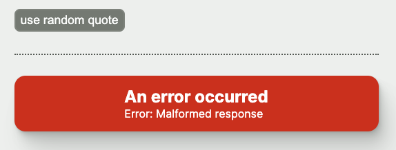
Simulate an error
You can trigger an error by updating hooks/use-quote-styles.ts. Replace the condition for the “Malformed response” error with if (true) so the error condition will trigger every time.
use-quote-styles.ts
// if (!json?.quote) {
if (true) {
  throw new Error("Malformed response");
}
Then start the server (if it’s not already running) refresh the page (which may have an old UI being displayed from a previous iteration of the code), and click the ‘use random quote’ button. You should see this:
Slow down the network
The loading spinner might be too quick to see easily (you’ll see it for longer after the next series, where we will contact OpenAI during the call). For now, to see the loading spinner for more than a flash, you can simulate a slower network using your browser’s dev tools (for example, here’s how to do it on Chrome ).
Don’t forget to undo this change when you’re finished! Otherwise you might come back to the page and wonder why it’s so terribly slow. 😄
Up next
Congratulations! 👏 You made it to the end of this series. Check out the next series that uses the OpenAI Node SDK to generate a color and font based on the quote’s content.
Please consider supporting my work!
Here are a few things that would really help:Let your network know about Hands-on Web Dev Challenges by posting a link and tagging me on LinkedIn or Twitter
Invite your friends to subscribe to the free Hands-on Web Dev Challenges newsletter
Tell me about your ideas for new workshops, by replying to a Substack email or posting on LinkedIn or Twitter
Become a paid subscriber to the newsletter
Workshops in this series
- Quotation endpoint
- Display fetched data
- Loading state
- Error state
- Custom hook
- Conditional rendering