The goal
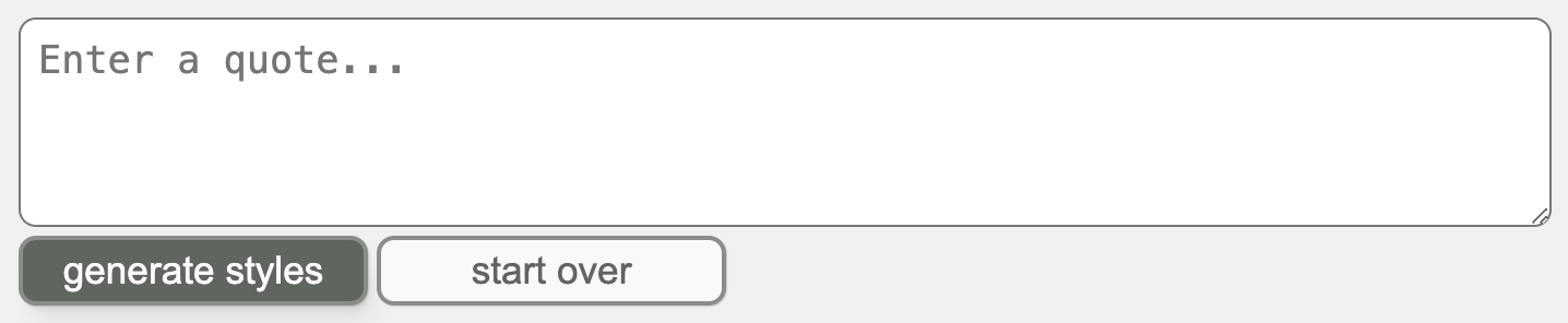
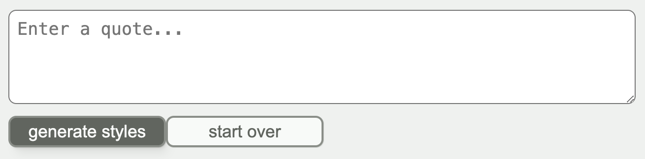
To review, the goal was to take this relatively unstyled layout:
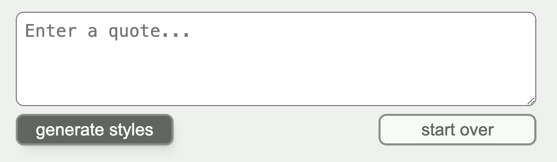
And create styling that results in this layout for wider screens:
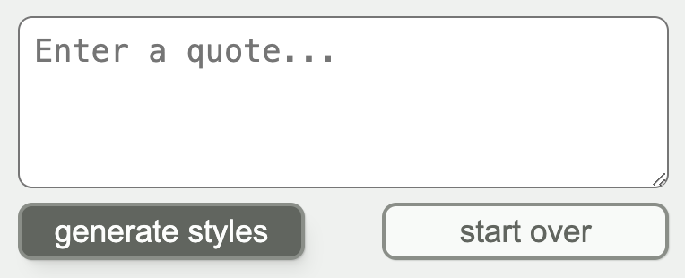
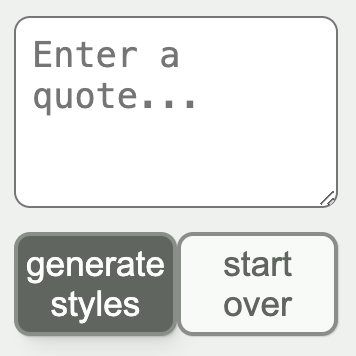
This layout for screens that are narrower, but still wide enough to have the buttons side-by-side:
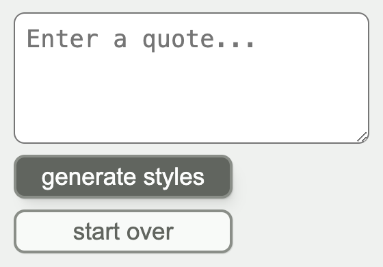
And this layout when the screen gets narrow enough that the buttons don’t fit:
This particular challenge specifies that there should be no media queries in the CSS.
Step 1: Create a div for the buttons
The buttons need a flex container , so let’s create a div containing them:
index.html
<body>
  <textarea
    placeholder="Enter a quote...">
  </textarea>
  <div class="buttons">
    <button>
      generate styles
    </button>
    <button class="secondary">
      start over
    </button>
  </div>
</body>
Then we can start setting up the spacing by creating a CSS custom property and adding it as a margin-top value. The custom property will come in handy because we will want to use the same value as the gap for the flex container.
style.css
.buttons {
  --gap: 0.5rem;

  display: flex;
  margin-top: var(--gap);
}
Here’s what we’ve got so far:
Step 2: Add flex styles
justify-content
- Since the buttons sit at either end of the container when there’s enough room for both of them, we want justify-content: space-between .
- The flex direction is
rowsince they’re aligned horizontally. This is the default, so there’s no need to specify. - The height of the container is the same as the height of the buttons (because we haven’t specified a height, the div will default to the height of its tallest element), so there’s no need to specify an align-items value. There’s no room within the container for the buttons to move vertically (along the cross axis, which
align-itemscontrols).
style.css
.buttons {
  --gap: 0.5rem;

  display: flex;
  justify-content: space-between;

  margin-top: var(--gap);
}
This works well when there’s enough space for the buttons, but they get squished when the viewport gets too narrow:
flex-wrap and gap
We could use a media query to change the flex-direction to column when the screen gets too narrow. However, this requires a guess as to how narrow is “too narrow” (in this case, the buttons have a fixed width, but you could imagine buttons that have a variable width based on the length of the content).
Fortunately, there’s another flex property we can use: flex-wrap . By setting flex-wrap to wrap, the buttons will automatically wrap when the screen gets too narrow.
Adding a gap value creates a gap between the buttons when they wrap. We can use the CSS custom property we created earlier for the value.
style.css
.buttons {
  --gap: 0.5rem;

  display: flex;
  justify-content: space-between;
  flex-wrap: wrap;
  gap: var(--gap);

  margin-top: var(--gap);
}
And voila! The narrow viewport now appears as specified.