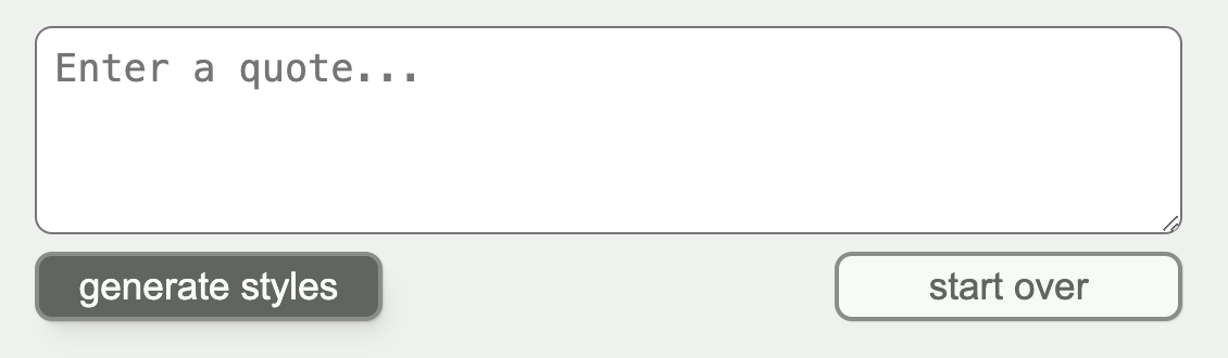
Here is a layout from my upcoming series on using the OpenAI API to generate a color and font based on a quote:
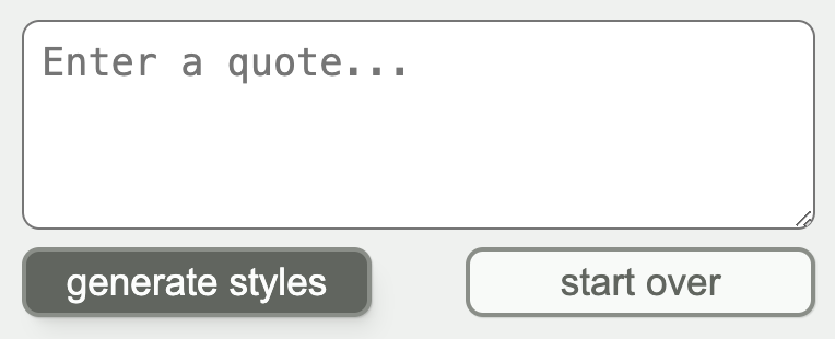
When the screen gets narrower, the buttons get closer together (and the textarea gets narrower too, but that’s not part of this flexercise. 😄)
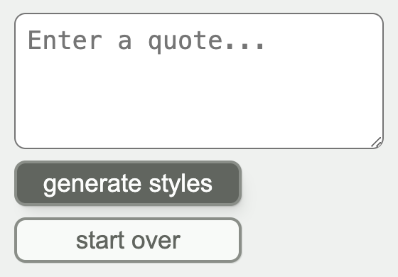
When the screen gets narrow enough that the buttons don’t fit, they end up stacking on top of each other:
Your challenge
- Recreate the layout shown above from the starting code in the editable sandbox below.
- All of the elements should have a vertical gap of
0.5remseparating them. - Do not use any media queries .
- You may add new HTML elements and CSS classes as needed.
You can work within the editable sandbox below (if it doesn’t look like an editable sandbox, the page may need to be refreshed). Try making changes and the preview will update! You can drag the center divider to make the preview pane larger or smaller.
Here are a couple resources that may help:
- Josh W. Comeau’s blog post, An Interactive Guide to Flexbox – great for understanding what flexbox is all about.
- A Complete Guide To Flexbox from CSS Tricks – where I go when I need quick visual reference for which flexbox properties and values I want.