Here is a layout that might be a footer on a web site. Your goal is to add flexbox styles to match this layout (play the video to see how the styles change as the viewport width changes):
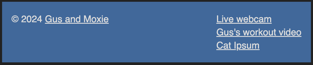
For still-image reference, here’s the view at viewport widths of 450px and wider:
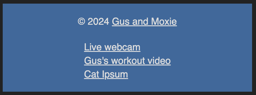
and the view at viewport widths of less than 450px:
This is an editable sandbox — try making changes and the preview will update! You can drag the center divider to make the preview pane larger or smaller.
Here are a few resources that may help:
- Josh W. Comeau’s blog post, An Interactive Guide to Flexbox – great for understanding what flexbox is all about.
- A Complete Guide To Flexbox from CSS Tricks – where I go when I need quick visual reference for which flexbox properties and values I want.
- Beginner’s Guide to Media Queries from MDN