The issues with this form are both with the “send it” button, and both can be corrected with the help of semantic HTML .
Issue 1: The button is a div
The button has been created using a div element, which creates some problems. The accessibility related problem is that the button is not focusable or interactive using a keyboard.
To demonstrate the lack of focusability: Try placing the focus on the “say something” textarea (mouse users can click in the text area, and keyboard users can hit the tab key until the area is focused). It will look something like this:
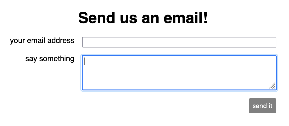
(Note the blue outline around the textarea to indicate that it’s focused.) Now type the tab key. For an accessible form, the focus would move to the “send it” button. However, in this case, the button has been implemented using a div — which means the tab goes to the next focusable element on the page. Since this is a Code Sandbox, the next focusable element will be outside the preview pane.
Even if you change the button to an “enabled” state (by entering non-empty input in both of the input fields), the “send it” element still isn’t focusable.
This “button” (in quotes, since it’s not a button element) is also not interactive using a keyboard. Even if you could focus the element, there are no default event handlers for the keydown or keyup events for a div.
The good news is that we get focusability and interactivity “for free” if we use the button element instead of the div element. This is why it’s recommended that all interactive elements on your page are either a button (to trigger actions) or an a (for a link that takes you to a new page).
Here a button is appropriate because this element will trigger the action of sending an email (or it would, if that functionality had been implemented. 😅)
HTML updates
Code with error
<div
  class="submit-button"
  onClick={handleSubmit}
  disabled={email.length === 0
    || content.length === 0}
>
  send it
</div>
Corrected code
<button
  class="submit-button"
  onClick={handleSubmit}
  disabled={email.length === 0
    || content.length === 0}
>
  send it
</button>
CSS updates
The other great thing about using the built-in button element is that we get a lot of styling built-in. Here are the styles that can be removed once the div element is changed to a button. Also, the syntax for disabled is cleaner, since disabled is a recognized state for a button (but not for a div).
Code with error
.submit-button {
  cursor: default;
  /* other rules */
}

.submit-button[disabled] {
  background-color: lightgray;
  pointer-events: none;
}
Corrected code
.submit-button {

  /* other rules */
}

.submit-button:disabled {
  background-color: gray;

}
But wait!
Now we can focus the button element with the tab key – but only when the button is enabled (that is, when there’s text entered into each of the input fields).
When the button is disabled, there’s no way to focus it. That leads us to…
Issue 2: Button can be disabled
Disabled buttons are not great from an accessibility standpoint – keyboard users skip right over them with the tab key (as we saw above), and screen reader users may take a lot of time trying to find the button in the form (disabled buttons are ignored by screen readers).
Experts recommend leaving the button enabled, but displaying an error if the required conditions aren’t met. Fortunately, HTML has some pretty good built-in tools for form validation . We’ll need to wrap the inputs in a form element (which is better semantic HTML than a div element anyway). Then we can add attributes to the input elements, and the web browser will take care of:
- interrupting the form submission
- displaying errors
Here’s what that would look like in the code:
Code with error
<div className="email-form">

  <label for="email" class="label">
    your email address
  </label>
  <input
    id="email"
    name="email"
    type="text"
    value={email}
    onChange={(event) =>
      setEmail(event.target.value)}

  />
  <label for="content" class="label">
    say something
  </label>
  <textarea
    id="content"
    name="content"
    value={content}
    onChange={(event) =>
      setContent(event.target.value)
    }

  />
  <button
    class="submit-button"
    onClick={handleSubmit}
    disabled={email.length === 0
      || content.length === 0}
  >
    send it
  </button>
</div>
Corrected code
<form className="email-form"
    onSubmit={handleSubmit}>
  <label for="email" class="label">
    your email address
  </label>
  <input
    id="email"
    name="email"
    type="email"
    value={email}
    onChange={(event) =>
      setEmail(event.target.value)}
    required
  />
  <label for="content" class="label">
    say something
  </label>
  <textarea
    id="content"
    name="content"
    value={content}
    onChange={(event) =>
      setContent(event.target.value)
    }
    required
  />
  <button
      class="submit-button"
      type="submit"


    >
    send it
  </button>
</form>
Now if the “send it” button gets pressed when the form is incomplete, the browser will show an error like this (notice, there’s even email validation for fields of type="email"!):
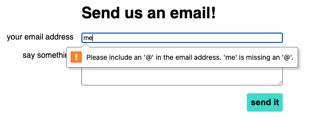
Something to note, though, is different browsers display the errors in (sometimes dramatically) different ways. The above screenshot is from Chrome; this is what the same thing looks like in Firefox:
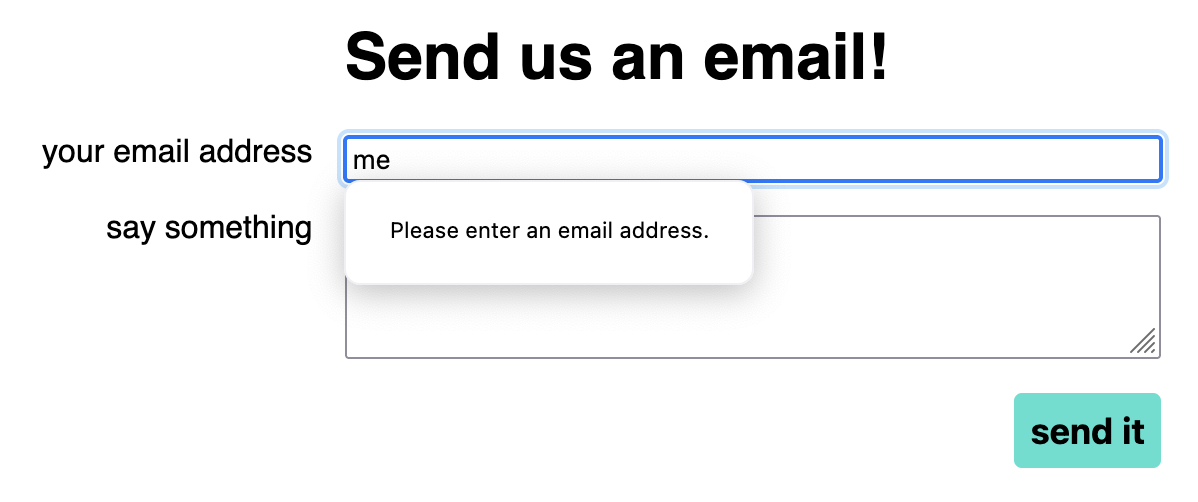
If you want your users to have a consistent experience across browsers, you’ll have to handle the validation. Form tools like Formik or React Hook Form are helpful for this.