This workshop was a little React and a whole lotta CSS.
You can find a summary of the code updates in this pull request .
Step 1: Create the component
I added a new ToC.tsx and ToC.module.css file within src/components/BlogPost. Why didn’t these get their own ToC folder? The ToC component is never going to be used outside BlogPost, so according to Josh W. Comeau’s recommended file structure , these can stay hidden in the BlogPost folder. They don’t need to be exposed to the rest of the application.
The component takes an array of HeadingData objects as a prop. I used a div as the top-level element instead of an aside because I’ll be using an aside wrapper in the BlogPost component.
components/BlogPost/ToC.tsx
import { HeadingData } from "@/helpers/headings-helpers";
import styles from "./ToC.module.css";

type ToCProps = { headings: Array<HeadingData> };

function ToC({ headings }: ToCProps) {
  return (
    <div className={styles.wrapper}>
      /* more stuff here in a minute... */
    </div>
  );
}

export default ToC;
Then, the HTML is structured to contain an h2 of “Contents” and a nav element that maps over the headings and creates a span for each. clsx is a utility that takes an array of classes and makes it into a string.
components/BlogPost/ToC.tsx
<div className={styles.wrapper}>
  <h2 className={styles.title}>Contents</h2>
  <nav className={styles.nav}>
    {headings.map(({ title, level }) => {
      return (
        // a `span` for now. Will become an `a` later.
        <span
          // this key assumes no duplicate heading titles
          // will be replaced with `id` in the future
          key={title}
          className={styles[`heading${level}`]}
        >
          {title}
        </span>
      );
    })}
  </nav>
</div>
Notice the class name based on the heading level in line 11. That will come up later!
I added the ToC component to the BlogPost component so that I could see it on the page — even though it’s not in the right place yet (it shows up after the post content).
BlogPost.tsx
async function BlogPost({ params }: BlogPostParams) {
  const { frontmatter, content, headings } = await loadBlogPost(
    params.postSlug
  );

  const { title, chatGPTPrompt } = frontmatter;

  return (
    <main className={styles.wrapper}>
      /* ... */
      <section className={styles.content}>
        <MDXRemote source={content} components={COMPONENT_MAP} />
      </section>
      <aside className={styles.toc}>
        <ToC headings={headings} />
      </aside>
    </main>
  );
}
Step 2: Style the component
This project uses CSS modules for CSS, which are conveniently supported by default with Next.js apps . This is why we can import the styles file (line 2 in the first code block above) and treat it as an object with classNames as the properties (for example, line 8 in the first code block). CSS modules takes care of scoping the styles to the component (which is why I can have a .wrapper class for every component, and it’s not a problem).
I used flexbox to style the nav, and I got the background color from src/app/globals.css .
I used a common .heading class for all the headings, and then added separate styles for .heading2 and .heading3. These are added by basing the class name on the heading level, as mentioned in step 1.
ToC.module.css
.heading {
  font-size: 0.9rem;
  line-height: 1.1;
}

.heading2 {
  composes: heading;
  /* heavier font for level 2*/
  font-weight: 600;
}

.heading3 {
  composes: heading;
  /* larger indent for level 3 */
  margin-left: 0.75rem;
}
The composes syntax is a feature of CSS Modules — it means to incorporate the styles from the other class as well, so you don’t have to list them both as classNames. I’ve only posted snippets of the styles file here, but you can see all of my styles at the end of this task in the project repo .
Step 3: Create a BlogPost grid
Now it’s time to tackle the overall layout of the blog post, with the table of contents included. I used a grid with grid areas . Here are the grid areas I used, using the browser dev tools to reveal the grid, and I added the grid area names (in blue) to the image.

The grid-related CSS for the BlogPost wrapper element looks like this:
BlogPost.module.css
.wrapper {
  /* ... */
  display: grid;
  grid-template-areas:
    "hero empty"
    "content sidebar";
  grid-template-columns: 1fr 18rem;
  gap: 2.5rem;
  /* ... */
}
The 1fr 18rem in the grid-template-columns value in line 8 means that the second column should be 18rem and the first column should be “1 fraction” – which in this case means “whatever’s left after the 18rem.”
The elements are placed into their grid areas like this (omitting unrelated rules for brevity):
BlogPost.module.css
.blogHero {
  grid-area: hero;
}

.content {
  grid-area: content;
}

aside.toc {
  grid-area: sidebar;
}
Finally, to make sure the table of contents lines up at the top of its cell, next to the top of the content, we need to add align-self: start.
BlogPost.module.css
aside.toc {
  grid-area: sidebar;
  align-self: start;
}
As far as the widths for the hero and content areas go, those are already managed for us by the var(--max-width) value that came with the BlogPost.module.css styles for each of those classes.
Step 4: Handle styled headings
This is looking pretty good! There’s something we haven’t considered yet, though. What if someone added some Markdown styling to the heading? For example, what if someone wanted to emphasize the word “Style” in the first heading, and wrote the markdown like this:
## Understanding Your Learning _Style_If you update the MDX file , you’ll see that the word in the heading itself is italicized, but the underscores remain in the table of contents:

We can use the MDXRemote component from next-mdx-remote to translate the heading string from MDX to React. This is the same component used to translate the entire blog post from MDX into React .
ToC.tsx
import { MDXRemote } from "next-mdx-remote/rsc";

// ...

function ToC({ headings }: ToCProps) {
  return (
    //...
    {headings.map(({ title, level }) => {
      return (
        <span
          key={title}
          className={styles[`heading${level}`]}
        >
          <MDXRemote source={title} />
        </span>
      );
    })}
    // ...
  );
}
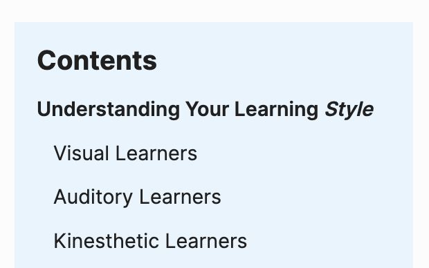
Now the table of contents looks better:

See you in the next workshop!