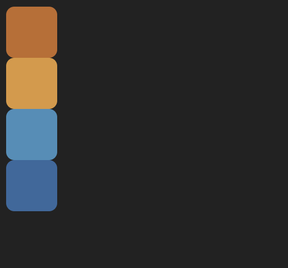
The goal was to add flexbox styles to go from this relatively unstyled layout:
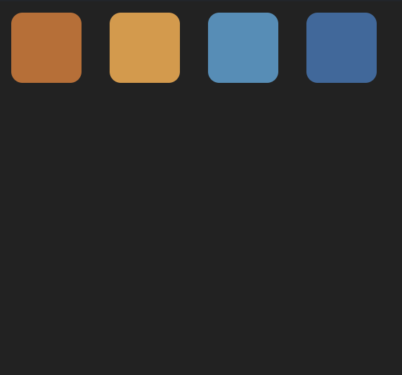
to this one:
Solution
The updated classes:
.wrapper {
  height: 100%;
  display: flex;
  align-items: center;
  gap: 20px;
}
.first {
  background-color: #c26b28;
  align-self: flex-start;
}
.fourth {
  background-color: #33699e;
  align-self: flex-end;
}
Explanation
Our flex container will be the div with the class wrapper. This contains all the boxes to be arranged.
The first thing to do is pick a flex direction. Here we want a flex-direction value of row, since the final layout shows the boxes from left to right (if the boxes needed to be arranged from top to bottom, we’d want a flex-direction of column). Since row is the default flex-direction value, we don’t need to add a flex-direction value explicitly.
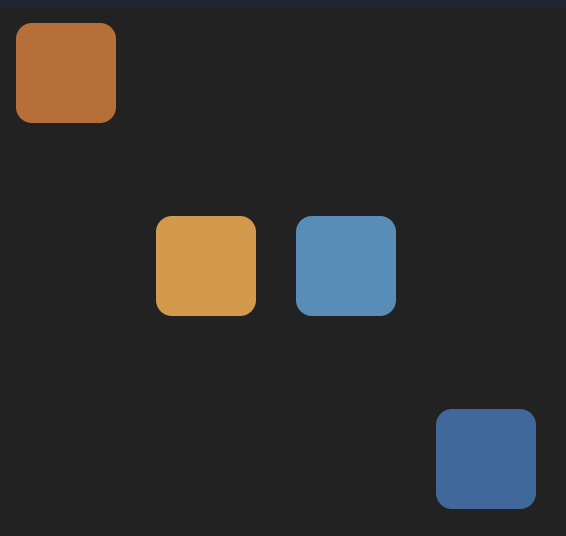
By adding display: flex (with the default flex-direction of row), the layout looks like this:
.wrapper {
  height: 100%;
  display: flex;
}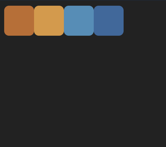
Then we can tackle the space between the boxes with the gap property. I’ve set this to 20px:
.wrapper {
  height: 100%;
  display: flex;
  gap: 20px;
}
Next we can align the boxes to be in the center of the frame along the axis perpendicular to the flex direction. In this case, the flex direction is horizontal (row) so align-items: center will center the items vertically:
.wrapper {
  height: 100%;
  display: flex;
  gap: 20px;
  align-items: center;
}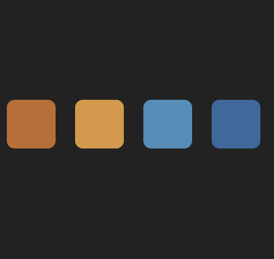
Finally, we can make exceptions for the alignment of the first and last boxes, by adding an align-self value for each. The first one is at the top, which is the start of the axis that align-items and align-self affect. Since the flex-direction for the container is row (a horizontal main axis), the align-* axis is perpendicular to that, in other words, vertical.
So the first box needs an align-self value of flex-start, and the last one needs a value of flex-end:
.first {
  background-color: #c26b28;
  align-self: flex-start;
}
.fourth {
  background-color: #33699e;
  align-self: flex-end;
}
Tada! 🎉
Stay tuned for more flexbox challenges in the coming weeks.
Resources
- Josh W. Comeau’s blog post, An Interactive Guide to Flexbox – great for understanding what flexbox is all about.
- A Complete Guide To Flexbox from CSS Tricks – where I go when I need quick visual reference for which flexbox properties and values I want.