Identify the accessibility (a11y) issues with this sign-in form! If you want to tinker with the code, you can find it on CodeSandbox .
Note: the form has not been wired up for any functionality; all of the issues are with the presentation.
index.html
<!DOCTYPE html>
<html lang="en">
  <head>
    <link
      rel="stylesheet"
      href="./styles.css">
    </link>
  </head>
  <body>
    <div class="container">
      <form class="signin-form">
        <h1>
          Sign in
        </h1>
        <span>
          username
        </span>
        <input
          name="username"
          type="text"
        >
        <span>
          password
        </span>
        <input
          name="password"
          type="password"
        >
        <button
          type="submit"
          class="submit"
        >
          sign in
        </button>
      </form>
    </div>
  </body>
</html>
styles.css
html, body, .container {
  height: 100%;
  width: 100%;
  font-family: futura, sans-serif;
}
body {
  background-color: #192835;
}
h1 {
  color: #dd973b;
}
button {
  all: unset;
  width: 8ch;
  display: flex;
  justify-content: center;
  background-color: #c26b28;
}
button, input {
  padding: 0.25rem;
  border-radius: 0.25rem;
  margin-bottom: 0.75rem;
}
form {
  width: 20ch;
  display: flex;
  flex-direction: column;
  gap: 0.5rem;
  color: white;
  background-color: #33699e;
  padding: 2rem;
  border-radius: 1rem;
}
.container {
  display: grid;
  place-content: center;
}
.submit {
  align-self: flex-end;
}
Here’s a rendered version of the sign-in form (alas, no sign-in will occur when you click the button):
Issue 1: Color contrast in heading
WCAG recommends a minimum contrast ratio between text and background, to make sure the text is easily readable for as many people as possible. According to the color.review tool , the contrast ratio for the heading on this form is 2.3, which is below the recommended minimum of 3.0 for large text. A better choice of text color here would be white or a very light gray.
Issue 2: Labels not linked to inputs
The labels for the input fields (“username” and “password”) aren’t associated with the inputs — which can be confusing for folks who use screen readers to interact with web pages. We can fix this by associating a label with the id of the input field:
Code with error
<span>
  username
</span>
<input

  class="form-field"
  name="username"
  type="text"
/>
Corrected code
<label for="username">
  username
</label>
<input
  id="username"
  class="form-field"
  name="username"
  type="text"
/>
See this W3C guide for reference, and for other accessible ways to associate labels with input fields.
Issue 3: Button doesn’t show focus
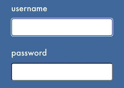
This one’s subtle, especially if you’re not used to thinking about it! If you’re on a device that uses a keyboard, try this: in the rendered version of the form above, click the input field for “username”. Notice the outline indicating the element is focused (that is, any keyboard entry will be applied to that element).

(The actual outline may look different than the image above, depending on the browser you’re using, but there should be an outline.) Then hit the tab key on your keyboard. This moves the focus to the next focus-able element: the “password” input.
Hit the tab key again. The focus is now on the Submit button, but there’s no outline indicating that. This is a problem for people who use a keyboard (instead of the mouse) to navigate. Without the outline, the currently focused element is something of a mystery.
The culprit here the unset: all rule for button in styles.css. In addition to removing some default browser styling for the button element (which we wanted), this rule also removes the outline property on focus (which we don’t want). We can reinstate the outline — while still unsetting all the other styles — by using the revert value when the button is focused:
styles.css
button:focus {
  outline: revert;
}
Try adding this to styles.css in the CodeSandbox to see the difference! (Note, you’ll have to sign in to be able to save your changes, but you can create a free account.)
Further Reading
These are just a few of the dozens of accessibility considerations for web developers. Stay tuned for future accesibility challenges in the Hands-on Web Dev newsletter ! In the meantime, check out these sites for more information: